
Colour Matters…But Perhaps Not in the Way We’re Often Told
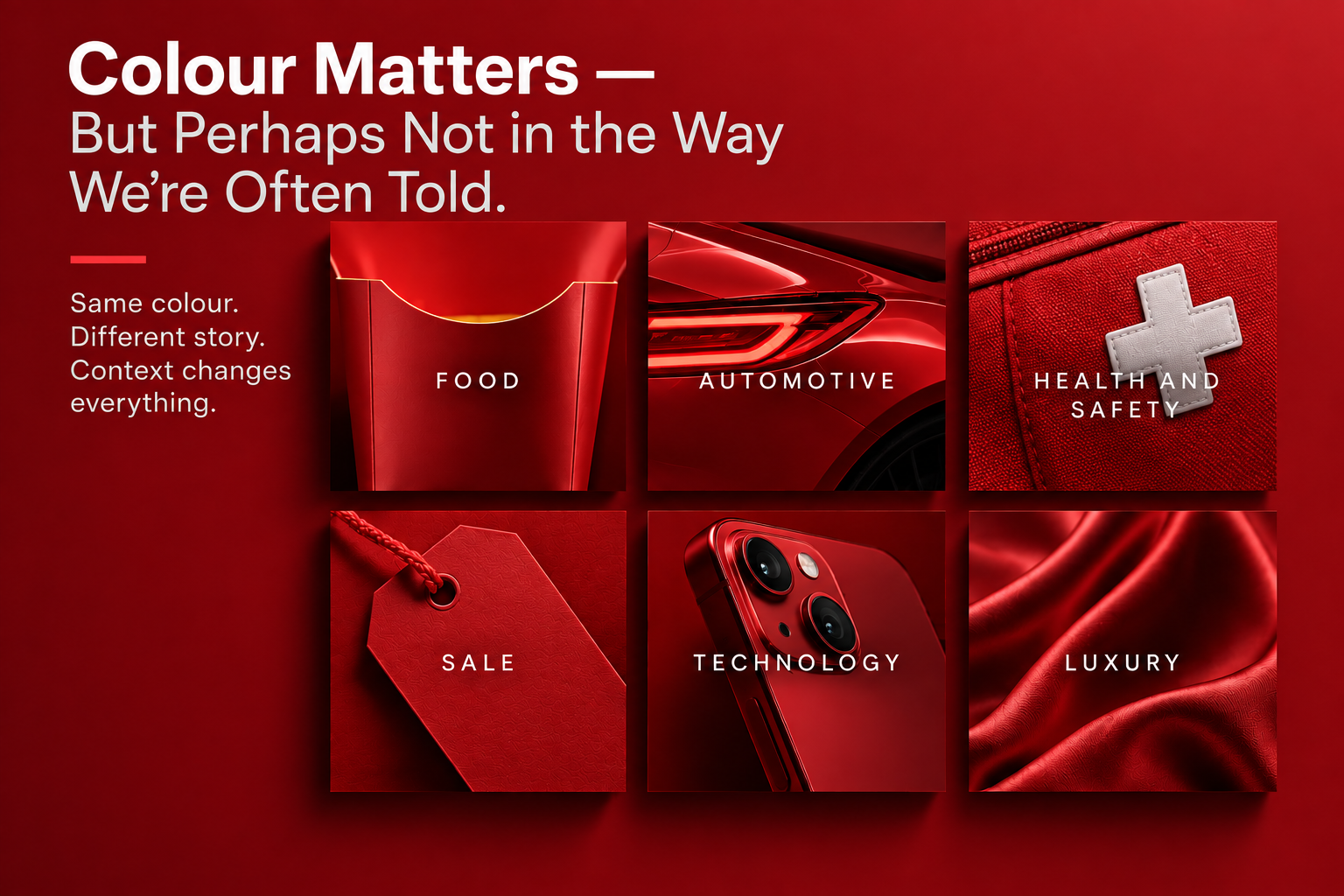
We’re often given a simple dictionary for colour: red means passion, blue means trust, green means nature, yellow means optimism. But the research tells a more interesting story.
We’ve all seen them; infographics explaining what different colours supposedly mean in branding. Red creates excitement. Blue creates trust. Green represents health and nature. Purple suggests luxury. Yellow communicates happiness. Black feels sophisticated.
They’re useful because they make something complicated feel simple. But branding rarely works that simply.
Colour does matter. There is considerable research showing that colour can influence how people perceive brands, products and even their willingness to buy them.[1] The more interesting question, however, isn't whether colour matters. It's why it matters, and whether the same colour means the same thing in every situation.
The answer appears to be no.
We Think We Know What Colours Mean
Colour is one of those areas of branding where common wisdom can sound more definitive than the evidence actually is.
We like rules because rules make decisions easier. If blue means trust, then a company looking to appear trustworthy should use blue. If green means health, a healthcare brand should use green. If black means luxury, a premium brand should use black.
Except brands don't operate in isolation.
A colour doesn't arrive in someone's mind carrying a single universal definition. Its meaning is influenced by what surrounds it, what it is attached to and what the audience already expects.
Research by Labrecque and Milne found that colour can influence perceptions of brand personality, including traits such as excitement and competence.[1] But their work also demonstrates that characteristics such as saturation and value can change those perceptions.
In other words, even when we talk about blue, we're not necessarily talking about one thing. For instance, a deep navy blue and a bright electric blue may technically belong to the same colour family, but they can tell very different stories. And that is where the simple colour charts [infographics] begin to fall short.
Colour Doesn't Speak Alone
Imagine a red logo. On its own, we might attach all kinds of meanings to it: energy, excitement, urgency, passion or even danger. Now put that same red logo on a children's toy company. Then on a luxury automobile. Then on a fast-food restaurant. Then on a financial services company. The colour hasn't changed. The context has.
Research increasingly supports this idea. Colour meanings are shaped by the surrounding visual environment and the context in which the colour appears.[5] Even something as seemingly secondary as the background behind a logo can change how the logo's colour is interpreted.
A colour that appears positive in one context can take on a very different meaning in another.
This is important because brand colour is rarely experienced as a colour swatch. Customers encounter it as part of a logo, a website, a storefront, packaging, signage, advertising, photography, typography and physical environments.
Colour is one part of a larger visual language. That means asking whether blue means “trust” is probably the wrong question. A better question is: What does this particular blue communicate in this particular context?
Every Industry Has Its Own Colour Language
There is another reason the colour infographics can be misleading: categories develop expectations.
Think about walking through a grocery store. You would probably expect certain visual cues from a package of organic food. You would expect different cues from an energy drink. Different again from a financial product. Different again from a children's toy.
Over time, industries develop visual conventions. Some colours become associated with particular categories, and consumers learn those associations.
Research into package design has found that colour norms within product categories can influence how consumers respond to products. When packaging uses an atypical colour, consumers may become more skeptical or less interested because the product doesn't immediately fit their expectations.[4]
This doesn't mean that brands should simply follow the colour rules of their industry. It means they need to understand the rules before deciding whether to follow them.
That's an important distinction.
If every financial company uses blue, choosing blue may help a new financial brand look familiar and credible. But choosing orange, yellow or pink might create differentiation.
The question becomes whether that differentiation is useful.
If the goal is to look like everyone else in the category, distinctiveness may be a problem. If the goal is to challenge the category, sameness may be the bigger problem.
The strategic answer depends on what the brand is trying to accomplish.
But Should Your Brand Follow the Rules?
This is where colour becomes particularly interesting from a branding perspective. A colour that is common within a category can help a brand feel familiar. However, if everyone uses the same colour, it becomes much harder for one brand to own it.
Conversely, an unusual colour can create attention and differentiation, but it can also create uncertainty if it conflicts too strongly with what people expect from the category.[4]
There is no universal answer.
A brand doesn't necessarily need to conform to its industry's colour conventions. Nor does it need to rebel against them. It needs to understand what those conventions are and decide deliberately what role colour should play in its positioning.
That decision might be about belonging. It might be about differentiation. It might be about signalling quality, innovation, heritage, accessibility or energy. Or it might simply be about becoming recognizable.
The important thing is that the decision is strategic rather than aesthetic.
Same Colour. Different Story.
Culture complicates the picture even further.
Research examining colour meanings across countries has found both similarities and differences in colour preferences and associations.[3] Aslam's cross-cultural review similarly argues that colour should be considered in relation to cultural values, marketing objectives and the relationship a brand wants to establish with its audience.[2]
That means there isn't necessarily a global dictionary of colour. A colour that feels appropriate and familiar in one market may communicate something different somewhere else. This matters even for brands that operate entirely within Canada.
Canada isn't culturally uniform. Different audiences bring different experiences, expectations and associations to the brands they encounter. As businesses increasingly operate across markets, languages and cultures, treating colour as a universal language becomes even less reliable.
Colour Can Help Position a Brand
Perhaps the most useful way to think about colour is not as a message in itself, but as a tool for reinforcing a message. A brand that wants to feel innovative might use colour differently from a brand that wants to emphasize heritage. A brand built around affordability might make different choices from one built around exclusivity. A brand positioned around adventure might use colour differently from one positioned around calm and simplicity. None of those choices are inherently right or wrong; they just become right or wrong in relation to the brand.
Recent research into luxury brands provides an interesting example. Less saturated colours can enhance perceptions of luxury and status when they reinforce a sense of heritage and continuity. But that effect can change when a brand positions itself around innovation or being newly established.[6]
The same basic principle appears again: the meaning of colour depends on the story surrounding it. Colour doesn't determine the positioning; it helps communicate it.
So What Colour Should Your Brand Be?
This may be the least satisfying question in branding because there isn't a universal answer. We can't look at a brand and say, “You should be blue.” We need to understand the brand first.
What category is it competing in? What do customers already expect? What does the brand want to be known for? What does it want to challenge? Who is it trying to connect with? What cultural context does it operate within? And perhaps most importantly, what should the visual identity help people understand about the brand? Only then does colour become particularly useful.
This is also why choosing a brand colour simply because the owner likes it can be a dangerous exercise. Personal preference isn't irrelevant. But it shouldn't be the strategy. The fact that we like a particular shade doesn't tell us whether that shade helps the brand become more recognizable, more distinctive or more meaningful to the people we want to reach. The question isn't simply, “What colour do we like?” It's “What should this colour help our brand say?”
Colour Matters. Context Matters More.
Colour matters and the research is quite clear about that but perhaps colour matters in a more complicated and useful way than the familiar infographics suggest.
There isn't a universal dictionary where red means one thing, blue means another and green means something else. Colour is interpreted through context. It interacts with the category, the culture, the surrounding design, the product, the audience and the position a brand is trying to occupy.[1][2][3][4][5]
That doesn't make choosing a colour less important. It makes the decision more important because if colour can influence perception, then choosing one isn't simply a design decision. It is a brand decision.
Perhaps that's the biggest lesson we can take from studying colour; colour doesn't build a brand on its own but the right colour, used in the right context, can help a brand become easier to recognize, easier to understand and harder to forget.
What This Study Teaches Us
The more we study branding, the more we find that seemingly simple decisions rarely are; colour is a perfect example of this.
We can reduce it to a chart of meanings, but doing so removes much of what makes colour useful. The strategic opportunity isn't in finding the colour that supposedly represents a particular emotion. It's in understanding the environment in which that colour will live and deciding what role it should play.
Colour should not simply reflect what a brand is. It should help communicate where the brand wants to go. Perhaps that's a better way to think about colour in branding:
Don't ask what a colour means. Ask what it means here.
Selected Research & Reading
[1] Labrecque, L. I., & Milne, G. R. (2012). Exciting red and competent blue: The importance of color in marketing. Journal of the Academy of Marketing Science, 40, 711–727.
[2] Aslam, M. M. (2006). Are you selling the right colour? A cross-cultural review of colour as a marketing cue. Journal of Marketing Communications, 12(1), 15–30.
[3] Madden, T. J., Hewett, K., & Roth, M. S. (2000). Managing images in different cultures: A cross-national study of color meanings and preferences. Journal of International Marketing, 8(4), 90–107.
[4] Garaus, M., & Halkias, G. (2020). One color fits all: Product category color norms and (a)typical package colors. Review of Managerial Science, 14, 337–358.
[5] Celhay, F., & Luffarelli, J. (2024). Competent or sad blue? Lively or aggressive red? Why, how, and when background color shapes the meanings of logo hues. Journal of Consumer Research, 51(4), 820–844.
[6] Color of Status: Color Saturation, Brand Heritage, and Perceived Status of Luxury Brands. (2026). Journal of Consumer Research, 52(6), 1232–1252.